|
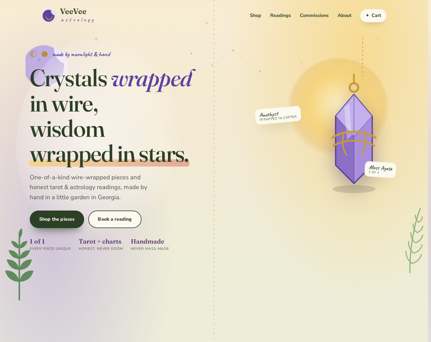
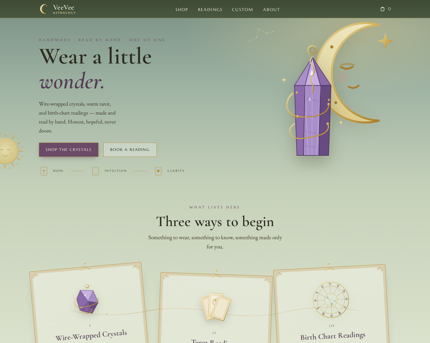
Issue 05 · The build My daughter is starting a business. Astrology readings, birth charts, and crystal jewelry she wraps by hand. She needed a website. I don't build websites. I talked to an AI and built her one anyway. Then I rejected it. Twice. Both times after the design had already passed a formal quality review. I'm not a designer. I'm her dad. But I knew it wasn't her yet, and that gap, between "the review passed" and "this still isn't right," is the most useful thing I learned this month. So this is the long version. What I actually built Six real pages, not a one-pager. Home, an about page, a shop, a tarot booking page, an astrology page, and a contact form. Custom vintage-tarot artwork made for her. Her real jewelry photos. Her palette: sage green, lavender, gold, on warm aged-paper. Three reading tiers with real prices. It looks like a brand that has existed for years, the kind an agency charges thousands for. The honest cost: a few dollars of AI image credits for the artwork, plus the Claude subscription I already pay for every month. That's it. No developer, no template marketplace, no Wix, no monthly site fee. I want to be straight about that subscription, because "it cost nothing" is a lie people tell in these posts. It cost the one thing I already pay for. But that one thing built the whole site, not a piece of it. Rejection #1: the children's book First real draft. Flat little cartoon crystals. Nursery pastels. One flat cartoon crystal floating in a lot of empty pastel space. It was clean, it worked on a phone, and it had absolutely nothing to do with tarot. The review didn't flag any of that. I did. It read like a kids' book, not a metaphysical brand, and I wasn't about to hand my daughter a kids' book. "Just because you use the words crystals and tarot doesn't mean it feels like them." Rejection #2: the one that passed the audit So I made it grown-up. Elegant type, a sage palette, gold linework, sections framed like tarot cards, a little moon with a face. Genuinely more refined. I ran it through two separate design reviews, composition, accessibility, contrast, and it passed both. On paper it was a good website. But I kept looking at it and asking the same question: where's the vintage art? The frames were there. The feeling wasn't. Flat drawn illustration cannot carry a look that is supposed to feel hand-painted. I had passed the test and failed the assignment. Two reviewers graded the craft. Neither of them was grading whether it felt like her. That part was on me. More polished. Two reviews said it was good. It still wasn't her.
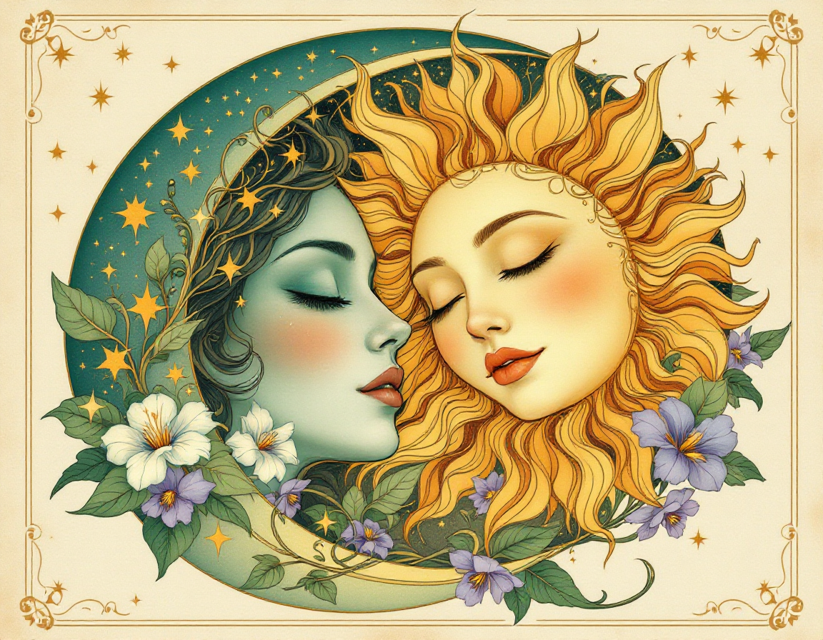
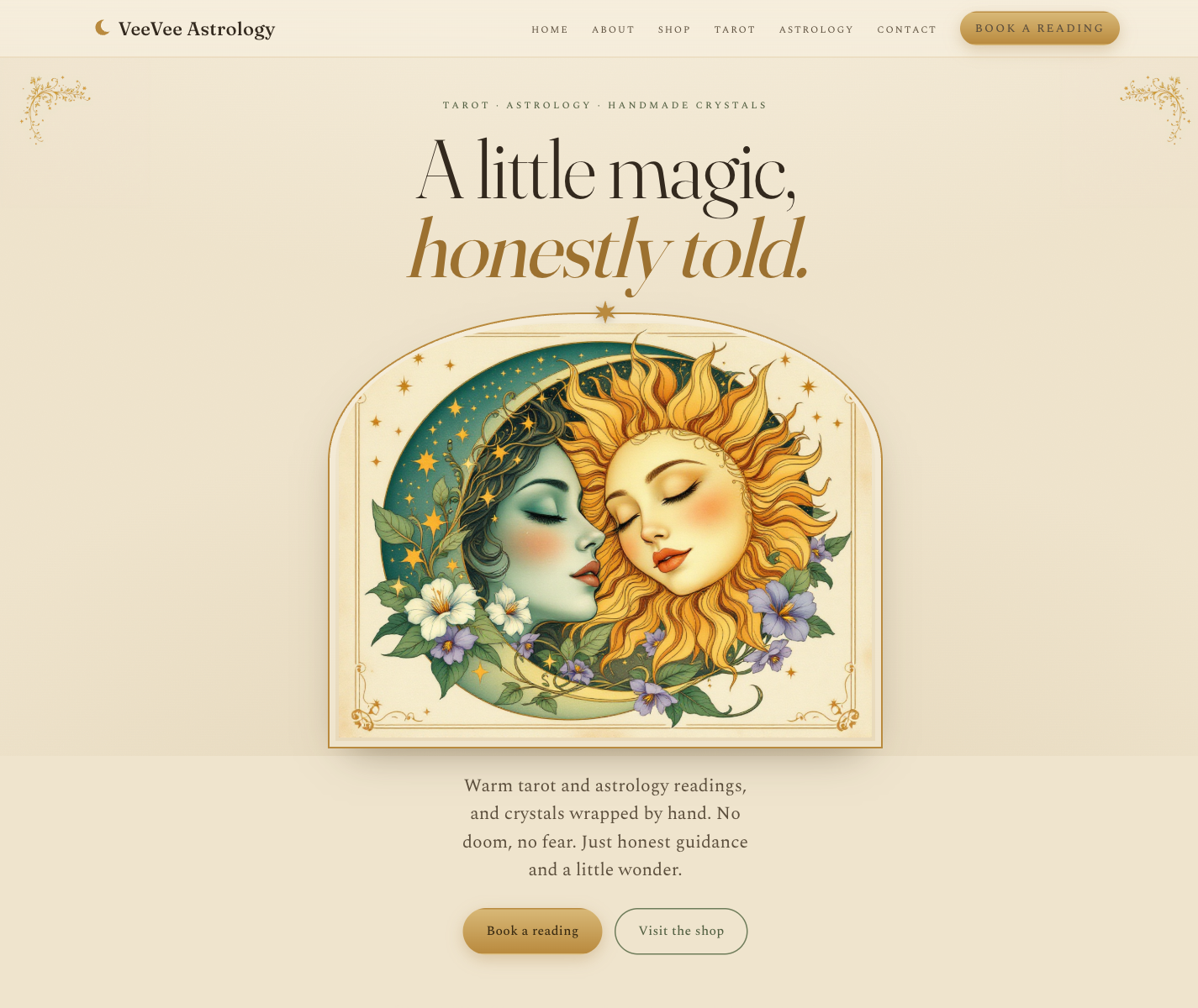
What both rejections were actually telling me Same mistake, twice, wearing two different outfits. I kept handing the AI the words and letting it fill in the feeling. "Tarot." "Crystals." "Mystical." An AI hears a vague word and gives you the most generic version of it, and the generic version of "whimsical spiritual" is a children's book. When I tried to fix that by going minimal, I just gave it a different generic. I never showed it the specific, lush, gilded thing I actually meant. The fix: change the job, not the prompt Here's the unlock, and it wasn't a cleverer sentence. It was a different job entirely. I had been asking the AI to draw, in thin linework, a look that only exists when it's painted. Wrong medium. So I stopped asking it to draw and started asking it to generate the real thing: dense, gold-leaf, art-nouveau tarot illustration, the kind that looks hand-painted on old paper. Then I built the page around that art instead of decorating an empty page with a little of it. This is the same AI that gave me the moth. I just finally pointed it at the right thing. The result Third version, she loved it. Same AI. Same me. Same brief I'd had the whole time. The only thing that changed was that I stopped feeding it vocabulary and started feeding it the exact feeling, in the exact medium that feeling lives in. Draft 3. The one that survived. Steal this Four things I'll do on every build from now on, whether it's a website, a logo, or a piece of writing.
She's launching soon. I got to build my kid's business alongside her, for a cost that rounds to nothing, because I was willing to throw away two versions a computer told me were fine. That's the part I can't get over. Not that the AI built it. That it let me be the dad who built it. You can build one yourself. That's what this newsletter is for, and I'll keep showing you how. But if you want a site like hers and would rather not learn any of it, building them is the other thing I do. A small deposit starts it, and you don't pay the rest until it's live and you love it.
Or get the kit free Get 3 friends to subscribe with your personal link and the $29 kit is on the house. No catch, just a deal between us.
Your referral link is yours as soon as you subscribe. Hit 3 and the code lands automatically. See you next issue, Tim Some Guy & AI ✦ |
I built my daughter's business with AI, then rejected it twice.
Two passing audits, one stubborn dad, and the fix that finally worked.

Jul 7, 2026
•
4 min read